纸上得来终觉浅,绝知此事要躬行。
层叠样式表(CSS),又称串样式列表、级联样式表、串接样式表、阶层式样式表,是一种用来为结构化文档(如 HTML 文档或 XML 应用)添加样式(字体、间距和颜色等)的计算机语言,由 W3C 定义和维护。目前最新版本是 CSS2.1,为 W3C 的推荐标准。CSS3 现在已被大部分现代浏览器支持,而下一版的 CSS4 仍在开发中。
1. CSS 简介
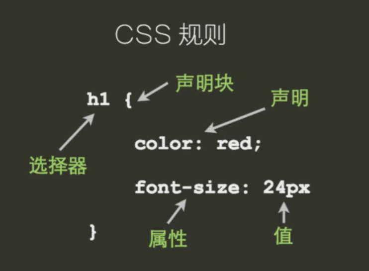
1.1 CSS 规则
1.2 代码风格
/* 单行书写 */
h1 {
  color: red;
  font-size: 14px;
}

/* 推荐分行书写 */
h1 {
  color: red;
  font-size: 14px;
}
1.3 使用 CSS
/* 外链 */
/* html和css分别存储, 易于管理 */
<link rel="stylesheet" href="/path/to/style.css" type="text/css">

/* 嵌入 */
/* 可以减少一个css的http请求, 可以使用浏览器缓存中的css样式 */
<style type="text/css">
    li { margin: 0; list-style: none; }
    p { margin: 1em 0; }
</style>

/* 内嵌 */
/* 用于性能优化以及页面调试中使用 */
<p style="margin: 1em 0">Example</p>
2. 简单选择器
选择器用来从页面中的元素,给他们定义样式
2.1 通配选择器
* {
  box-sizing: inherit;
}
2.2 标签选择器
p {
  margin: 1em 0;
}
2.3 id 选择器
<p id="example">Example Content</p>

<style type="text/css">
    #example {
        font-size: 14px;
        line-height: 1.6;
        color: red;
    }
</style>
2.4 类选择器
<p class="warning">这是一个警告信息</p>

/* 可以给一个元素指定多个class, 用空格隔开 */
<p class="warning icon">这里是别外一条警告信息</p>

<style type="text/css">
    .warning {
        color: orange;
    }

    .icon {
        background: url(warn.png) no-repeat 0 0;
    }
</style>
3. 高级选择器
3.1 属性选择器
<p>
    <label>用户名:</label>
    <input name="username" value="Escape" disabled>
</p>

<style type="text/css">
    input[disabled] {
        background: #eee;
        color: #999;
        cursor: not-allowed;
    }
</style>
<p>
    <label>密码:</label>
    <input type="password" required>
</p>

<style>
    input[type="password"] {
        border-color: red;
        color: red;
    }
</style>
/* output中的for属性表示输出结果来自那里 */
<p>
    <label>身高:</label>
    <input name="height">
</p>

<p>
    <label>体重:</label>
    <input name="weight">
</p>

<p>
    <label>BMI:</label>
    <output for="weight height">22</output>
</p>

<style>
    [for~="height"] {
        color: red;
    }
</style>
<p><a href="#top">回到顶部</a></p>
<p><a href="/home">回到首页</a></p>

<style>
    a[href^="#"] {
        color: red;
    }
</style>
<p><a href="#top">回到顶部</a></p>
<p><a href="/home">回到首页</a></p>

<style>
    a[href$="home"] {
        color: red;
    }
</style>
<i class="icon-user">用户</i>
<i class="icon-wifi">WiFi</i>
<i class="other1 icon-car">汽车</i>
<i class="icon-heart other2">爱心</i>

<style>
    [class^="icon-"], [class*=" icon-"] {
        color: coral;
        font-family: FontAwesome;
        font-style: normal;
        margin-right: 1em;
    }

    .icon-user::before {
        content: '\f007';
    }
</style>
3.2 伪类选择器
a:link {...}- 未访问过的链接
a:visited {...}- 已访问过的链接
a:hover {...}- 鼠标移动到链接上的样式
a:active {...}- 鼠标在链接上按下时的样式
a:focus {...}- 获得焦点时的样式
<nav>
    <ul>
        <li><a href="http://w3.org">W3C</a> </li>
        <li><a href="http://example.com">example</a> </li>
        <li><a href="http://www.baidu.org">baidu</a> </li>
    </ul>
</nav>
<label>搜索: <input name="search" type="search"></label>

<style>
    a:link {
        color: black;
    }
    a:visited {
        color: gray;
    }
    a:active {
        color: red;
    }
    :focus {
        outline: 2px solid red;
    }
</style>
3.3 选择器组合
- 直接组合
EF - 后代组合
E F - 亲子组合
E>F
直接组合
E[foo="bar"]E.warningE#myid#myid.warning.warning[foo="bar"]
/* 直接组合 */
<p class="warning">这是一条警告信息</p>
<div class="warning icon">这是另外一条警告信息</div>

<style>
    p.warning {color: orange; }
</style>
后代组合
亲子组合
<article>
    <h1>我爱</h1>
    <p>我爱中国</p>
    <section>
        <h2>你好</h2>
        <p>你好世界</p>
    </section>
</article>

<style>
    /*后代选择器*/
    article p {
        color: coral;
    }
    /*亲子选择器*/
    article > p {
        color: red;
    }

    article section h2 {
        border-bottom: 1px dashed #999;
    }
</style>
同时为一组选择器定义样式
body,
h1,
h2,
h3 {
  margin: 0;
  padding: 0;
}

[type="checkbox"],
[type="radio"] {
  box-sizing: border-box;
  padding: 0;
}
4. 文本样式
4.1 font-family
重点纪要
- 使用逗号分隔的字体族名称
- 初始值由浏览器设置决定, 可继承
- 英文字体放在中文字体前面
- 最后总是添加通用字体族
字体匹配算法
- 浏览器先获取一个系统字体列表
- 对于元素中每一个字符, 使用
font-family属性以及其他属性进行匹配, 如果能匹配就暂定该字体 - 如果步骤
2没有匹配上, 选择下一个可选的font-family执行步骤2 - 如果匹配到一个字体, 但是字体中没有该字符, 继续对下一个可选的
font-family执行步骤2 - 如果没有匹配到字体, 使用浏览器默认字体
<h1>JavaScript</h1>
<p>本课程介绍JavaScript的语法及事件、对象、DOM等基础知识。</p>

<style>
    h1 {
        font-family: Helvetica, sans-serif;
    }
    body {
        font-family: Georgia, serif;
    }
</style>
4.2 font-size
重点纪要
- 定义文字的大小, 可使用
px、百分比、em等作单位 - 取值
- 绝对值(
xx-small|x-small|small|medium|large|x-large|xx-large) - 相对值(
larger|smaller) - 长度
- 百分比, 相对于父元素计算值
- 初始值为
medium(由浏览器设置决定, 一般16px), 可继承
.slide-page li {
  font-size: 36px;
}

.slide-page li {
  font-size: 125%;
}

.slide-page li {
  font-size: 0.85em;
}
长度单位em
- 一般是相对于该元素
font-size的计算值的 - 用在
font-size属性上时, 是相对于父元素的font-size计算值
<section>
    <h2>JavaScript</h2>
    <p>本课程介绍JavaScript的语法及事件、对象、DOM等基础知识。</p>
    <p>本课程介绍JavaScript的语法及事件、对象、DOM等基础知识。</p>
</section>

<style>
    section {
        font-size: 26px;
    }
    section h2 {
        font-size: 2.5em;
        margin-bottom: 1em;
    }
</style>
4.3 font-style
重点纪要
- 定义字体以斜线或者是正常方式显示
- 取值:
normal|italic|oblique - 初始值为
normal, 可继承
<p>本课程介绍JavaScript的语法及事件、对象、DOM等基础知识。</p>

<style>
    p {
        font-style: italic;
    }
</style>
4.4 font-weight
重点纪要
- 定义文字的粗细程度
- 取值:
normal|bold|bolder|lighter|100|200| … |900 - 初始值为
normal, 可继承
取值含义
- 100 - Thin
- 200 - Extra Light
- 300 - Light
- 400 - Normal
- 500 - Medium
- 600 - Semi Bold
- 700 - Bold
- 800 - Extra Bold
- 900 - Black
- bolder - 比继承值粗
- lighter - 比继承值细
4.5 line-height
重点纪要
- 元素所属的
line box所占高度 - 初始值为
normal(具体值由浏览器决定), 可继承 - 取值: <长度> | <数字> | <百分比>
- 段落字体一般取值
1.4~1.8, 相对于自身属性的比值
/* section中定义的行高为18px, 而指定30px, 所以会字体压缩 */
<section>
    <h1>这是一个标题</h1>
    <p>我们的世界真好呀</p>
</section>

<style>
    section {
        width: 10em;
        font-size: 12px;
        /* 改为line-height: 1.5 */
        line-height: 1.5em;
    }
    h1 {
        font-size: 30px;
    }
</style>
font缩写
<h1>这是一个标题</h1>
<p>我们的世界真好呀</p>

<style>
    h1 {
        /* 斜体 粗细 大小/行高 字体族 */
        font: bold 14px/1.7 Helvetica, sans-serif;
    }
    p {
        font: 14px serif;
    }
</style>
4.6 Web Fonts
常见的外链字体网站
<h1>使用网络字体</h1>

<style>
    <!--自定义字体名称, 用服务器获取字体族-->
    @font-face {
        font-family: 'Lobster';
        font-style: normal;
        font-weight: 400;
        src: local('Lobster'),
            local('Lobster-Regular'),
            url(//lib.baomitu.com/fonts/...)format('woff'),
            url(//lib.baomitu.com/fonts/...)format('woff2');
    }
    h1 {
        font-family: 'LObster', cursive;
    }
</style>
4.7 text-align
重点纪要
- 定义文本在容器内对齐方式
- 取值:
left|right|center|justify(英文单词自动比例间隔) - 初始值由
HTML的dir属性决定, 可继承
<p>President Donald Trump’s rambling speech at a campaign-style rally in Phoenix, Arizona on Tuesday did not go down well with many people online.</p>

<style>
    p {
        width: 20em;
        text-align: justify;
    }
</style>
4.8 letter-spacing
重点纪要
- 指定字符之间的间距
- 取值:
normal|<length> - 初始值为
normal, 可继承
<p>President Donald Trump’s.</p>

<style>
    p {
        letter-spacing: 0.2em;
    }
</style>
4.9 word-spacing
重点纪要
- 指定单词之间的间距
- 取值:
normal|<length> - 初始值为
normal, 可继承
<p>President Donald Trump’s.</p>

<style>
    p {
        word-spacing: 0.2em;
    }
</style>
4.10 text-indent
重点纪要
- 指定文本缩进
- 取值:
normal|<length>|<percentage> - 初始值为
0, 可继承
<p>President Donald Trump’s.</p>

<style>
    p {
        text-indent: 2em;
    }
</style>
4.11 text-decoration
重点纪要
- 定义了文本的一些装饰效果, 比如下划线、删除线等
- 初始值为
none, 可继承 - 其他值:
underline|line-through|overline
<p>President Donald Trump’s.</p>

<style>
    p {
        text-decoration: overline;
    }
</style>
4.12 white-space
重点纪要
- 指定空白符如何处理
- 取值:
normal(按照屏幕比例自动缩放) |nowrap(不换行) |pre(按照指定格式) |pre-line|pre-wrap
<p>President Donald Trump’s.</p>

<style>
    p {
        white-space: pre;
    }
</style>
4.13 word-break
- 指定是否允许在单词中间换行
- 取值:
normal|break-all(强制拆行) |keep-all(优雅显示)
<p>The family of Payton Leutner, a Wisconsin
teenage girl who survived a stabbing -- allegedly
at the hands of two other teenage girls who
prosecutors say were trying to impress the
fictional character Slender Man -- said a plea
agreement for one of the accused teens "is what
is best."</p>

<style>
    p {
        width: 10em;
        word-break: normal;
    }
</style>
5. 浮动
定位模式
- 常规流(
Normal Flow) - 浮动(
Float) - 绝对定位(
Absolute Positioning)
5.1 常规流
常规流要点
- 除了根元素、浮动元素和绝对定位元素外, 其他元素都在常规流之内(
in-flow) - 而根元素、浮动元素和绝对定位元素会脱离常规流(
out of flow) - 常规流中的盒子, 属于块级格式化上下文或行格式化上下文
块级格式化上下文
- 盒子在容器(包含块)内从上到下一个接一个的放置
- 两个兄弟盒之间的竖直距离由
margin属性决定 - 同一个
BFC(块级格式化上下文)内垂直margin会合并 - 盒子的左外边缘挨着容器(包含块)的左边
行格式化上下文
- 盒子一个接一个水平放置
- 盒之间的水平
margin、border和padding都有效 - 同一行的盒子所在的矩形区域叫做行盒子(
Line box) - 当一个行盒放不下上下文内所以盒子时, 会被分到多个垂直堆叠的行盒里
- 行盒内水平分布由
text-align属性决定 - 如果一个行级块无法分割(单词、
inline-bolck), 该元素会被作为一个整体决定分布在哪一个行盒
5.2 浮动
浮动要点
- 浮动元素从常规流中脱离, 被漂浮在容器(包含块)左边或者右边
- 浮动盒会一直漂到其外边缘挨到容器边缘或另外的浮动盒
- 浮动元素不会影响其后面的流内块级盒
- 但是浮动元素后面的行级盒子会变短以避开浮动元素
<!--p标签因为是块级元素所以无视img, 而span是行级元素所以围绕排版-->
<section>
    <img src="http://p0.qhimg.com/t0117c2689d8703d551.jpg"
        width="120" alt="house">
    <p>
        <span>额济纳旗是中华人民共和国内蒙古自治区阿拉善盟辖下的一个旗,
            面积为114606平方公里,人口约2万,多为无人居住的沙漠区域。
            著名的酒泉卫星发射中心位于该旗,以胡杨林称著。</span>
    </p>
</section>

<style>
    img {
        float: left;
    }
    p {
        font-size: 14px;
        line-height: 1.8;
        border: 1px red solid;
    }
    span {
        border: 1px red solid;
    }
</style>
**clear**属性
- 指定元素那一边不能与之前的浮动框相邻
- 取值:
left(左边不能相邻) |right(右边不能相邻) |both(两边都不能相邻)
<!--h1的元素不与左右两边的浮动框相邻-->
<section>
    <img src="http://p0.qhimg.com/t0117c2689d8703d551.jpg"
        width="120" alt="house">
    <p>额济纳旗是中华人民共和国内蒙古自治区阿拉善盟辖下的一个旗,
            面积为114606平方公里,人口约2万,多为无人居住的沙漠区域。
            著名的酒泉卫星发射中心位于该旗,以胡杨林称著。</p>
</section>
<section class="cleared">
    <h1>胡杨林</h1>
    <p>额济纳旗是中华人民共和国内蒙古自治区阿拉善盟辖下的一个旗,
        面积为114606平方公里,人口约2万,多为无人居住的沙漠区域。
        著名的酒泉卫星发射中心位于该旗,以胡杨林称著。</p>
</section>

<style>
    img {
        float: left;
    }
    p {
        font-size: 14px;
        line-height: 1.8;
    }
    .cleared {
        clear: both;
    }
</style>
清除浮动的另外两种做法
<!--img的section中添加一个box, 相当于在img之后添加了一个div并定于clear:both属性-->
<style>
    .clearfix::after {
        content: ' ';
        display: block;
        clear: both;
        height: 0;
        overflow: hidden;
    }
</style>

<!--h1的section中添加一个box, 相当于在h1之前添加了一个div并定于clear:both属性-->
<style>
    .clearfix::before {
        content: ' ';
        display: block;
        clear: both;
        height: 0;
        overflow: hidden;
    }
</style>
块级格式化上下文(BFC)的特性
BFC内的浮动不会影响到BFC外部的元素BFC的高度会包含其内的浮动元素BFC不会和浮动元素重叠BFC可以通过overflow:hidden等方法创建
<!--给p标签添加左边距, 以及h1中换行-->
<section id="enter-line">
    <img src="http://p0.qhimg.com/t0117c2689d8703d551.jpg"
        width="120" alt="house">
    <p id="b-left">额济纳旗是中华人民共和国内蒙古自治区阿拉善盟辖下的一个旗,
            面积为114606平方公里,人口约2万,多为无人居住的沙漠区域。
            著名的酒泉卫星发射中心位于该旗,以胡杨林称著。</p>
</section>
<section>
    <h1>胡杨林</h1>
    <p>额济纳旗是中华人民共和国内蒙古自治区阿拉善盟辖下的一个旗,
        面积为114606平方公里,人口约2万,多为无人居住的沙漠区域。
        著名的酒泉卫星发射中心位于该旗,以胡杨林称著。</p>
</section>

<style>
    img {
        float: left;
    }
    #enter-line {
        overflow: hidden;
    }
    #b-left {
        overflow: hidden;
        padding-left: 10px;
    }
</style>
创建BFC的方法
- 浮动框
- 绝对定位框
- 非块级的块容器(
display: inline-block) overflow属性非visible的块框
BFC的作用
- 清除浮动
- 防止
margin折叠 - 双栏布局
5.3 绝对定位
position属性
static- 非定位, 默认值
relative- 相对定位(相对于自己), 在常规流里面布局
- 使用
top、left、bottom、right设置偏移长度 - 相对于自己本应该在的位置进行偏移, 流内其它元素当它没有偏移一样布局
absolute- 绝对定位, 相对非
static祖先元素padding box的定位 - 不会对流内布局造成任何影响
- 可以有
margin, 但不会折叠 fixed- 相对于视口绝对定位
- 不会随页面滚动发生位置变化
6. 层叠、继承和 css 单位
6.1 特异度级别
简单选择器的特异度级别
- 一级: *
- 二级: 类、伪类、属性
- 三级: id
- 四级: 内联
选择器的特异性
/* 哪条规则生效呢? 蓝色 */
<style>
    .title {
        color: blue;
    }
    article h1 {
        color: red;
    }
</style>

<article>
    <h1 class="title">中国,我爱你。</h1>
</article>
6.2 属性覆盖
属性覆盖演示
<button class="btn">普通按钮</button>
<button class="btn btn-primary">主要按钮</button>

<style>
    .btn {
        display: inline-block;
        padding: .36em .8em;
        margin-right: .5em;
        line-height: 1.5;
        text-align: center;
        cursor: pointer;
        border-radius: .3em;
        border: none;
        background: #e6e6e6;
        color: #333;
    }
    .btn.btn-primary {
        color: #fff;
        background: #218de6;
    }
</style>
important
<button class="btn">普通按钮</button>
<button class="btn btn-primary">主要按钮</button>

<style>
    .btn {
        display: inline-block;
        padding: .36em .8em;
        margin-right: .5em;
        line-height: 1.5;
        text-align: center;
        cursor: pointer;
        border-radius: .3em;
        border: none;
        background: #e6e6e6;
        color: #333 !important;
    }
    .btn.btn-primary {
        color: #fff;
        background: #218de6;
    }
</style>
<button class="btn">普通按钮</button>
<button class="btn btn-primary">主要按钮</button>

<style>
    .btn {
        display: inline-block;
        padding: .36em .8em;
        margin-right: .5em;
        line-height: 1.5;
        text-align: center;
        cursor: pointer;
        border-radius: .3em;
        border: none;
        background: #e6e6e6;
        color: #333 !important;
    }
    .btn.btn-primary {
        color: #fff !important;
        background: #218de6;
    }
</style>
6.3 cascading
声明起作用
- 找出匹配到的该属性所有声明
- 根据 css 样式的来源, 优先级从低到高
- 页面开发者
- 用户设置
- 浏览器预设
- 含
!important的网页样式 - 含
!important的用户设置 - 同一来源中, 按照特异度排序, 越特殊优先级越高
- 特异度一样时, 按照样式书写顺序, 后面的优先级高
继承
- 某些属性会自动继承其父元素的计算值, 除非显示指定一个值
<p>This is a <em>test</em> of <strong>inherit</strong>.</p>

<style>
    p { color: #666; }
    em { color: red; }
</style>
显式继承
* {
  box-sizing: inherit;
}

html {
  box-sizing: border-box;
}

.some-widget {
  box-sizing: content-box;
}
初始值
- CSS 中, 每个属性都有一个初始值
background-color的初始值为transparentmargin-left的初始值为0
各种类型的值
- 关键字:
font-size: initial - 字符串:
content: "abc" - URL:
background-image: url(/resources/logo.png) - 长度:
height: 100px - 百分数:
width: 40% - 整数:
z-index: 9 - 浮点数:
line-height: 1.5 - 颜色:
color: #555、color: rgba(0,0,0,0.5) - 时间:
transition-duration: 0.3s
长度单位
- 绝对单位
px: 像素in: 英寸- 英寸
cm: 厘米 - 厘米
mm: 毫米
相对单位
em: 相对于该元素的一个 font-sizerem: 相对于 html 的一个 font-sizevh: 浏览器窗口高度的 1%vw: 浏览器窗口宽度的 1%vmin: vh 和 vw 中的较小者vmax: vh 和 vw 中的较大者
6.4 颜色
颜色的定义方法
- 关键字
- 颜色的单词拼写
Hex- hex 值表示
RGB & RGBA- 红、黄、蓝三原色
HSL & HSLA- Hue(色相)、Saturation(饱和度)、Lightness(亮度)
background: red;
background: hex(#234454)
background: rgb(82,24,53)
background: rgba(0,0,0,0.5)
background: hsl(0,50%,50%)
background: hsla(0,50%,50%,0.5)
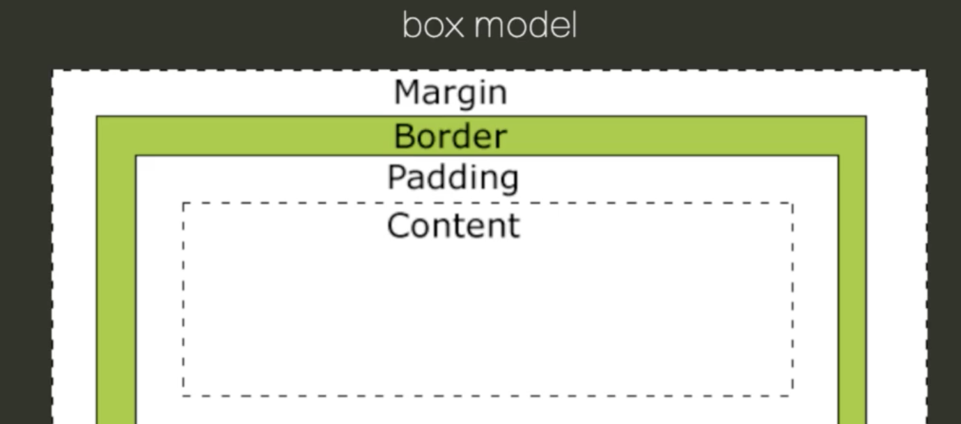
7. 盒模型
7.1 width 属性
- 指定
content box的宽度 - 百分数相对于父容器的
content box的宽度
7.2 height 属性
- 指定
content box的高度 - 百分数相对于父容器的
content box的高度 - 只有当包含块的高度不依赖该元素时, 百分比高度才有效
<div class="container">
    <div class="child">属性具有重叠的功能, 制定规则的顺序很重要</div>
</div>

<style>
    body {
        margin: 0;
    }
    .container {
        background: lightblue;
        height: 100vh;
    }
    .child {
        height: 50%;
        background: coral;
    }
</style>
7.3 padding 属性
- 内边距
- 属性
paddingpadding-toppadding-rightpadding-bottompadding-left
7.4 margin 属性
- 外边距
- 属性
marginmargin-topmargin-rightmargin-bottommargin-left
- 特点
margin折叠margin可以为负值
7.5 box-sizing 属性
- 改变盒模型计算方式
- 取值:
border-box(属性值减去border和padding) |content-box(内容框,都不减去) - 初始值:
border-box
<div class="box a">Box A</div>
<div class="box b">Box B</div>

<style>
    .box {
        width: 100px;
        height: 100px;
        padding: 10px;
        border: 10px red solid;
        background: #f99;
        margin: 1em;
    }
    .b {
        box-sizing: border-box;
    }
</style>
7.6 border 属性
- 边框的三要素
border-width: <length> | thin | medium | thickborder-style: none | solid | dashed | dotted | doubleborder-color: <color>
- 四个方向
border-leftborder-topborder-rightborder-bottom
- 不同的写法
border-width: 1px 2px;border-left-width: 1px;border-left: 1px solid red;border: 1px solid red;
<div class="box"></div>

<style>
    .box {
        border-width: 50px;
        border-style: solid;
        border-color: #f35 #269 #649 #fa0;
        transition: all 2s ease-in;
        width: 200px;
        height: 200px;
    }
</style>
7.7 min-width & max-width
<section>
    <p>额济纳旗是中华人民共和国内蒙古自治区阿拉善盟辖下的一个旗。</p>
    <p>著名的酒泉卫星发射中心位于该旗,以胡杨林称著。</p>
</section>

<!--最大的宽度是40, 最小的宽度是20, 否则换行-->
<style>
    article {
        line-height: 1.7;
        max-width: 40em;
        min-width: 20em;
        font-family: serif;
    }
</style>
7.8 min-height & max-height
<section>
    <p>额济纳旗是中华人民共和国内蒙古自治区阿拉善盟辖下的一个旗。</p>
    <p>著名的酒泉卫星发射中心位于该旗,以胡杨林称著。</p>
</section>

<!--最大的宽度是40, 最小的宽度是20, 否则换行-->
<style>
    article {
        line-height: 1.7;
        max-height: 40em;
        min-height: 20em;
        font-family: serif;
    }
</style>
7.9 overflow 属性
- 溢出控制, 内容超出时的摆放位置
- 控制方向
overflow-x(x 方向) |overflow-y(y 方向)
- 取值
visible(内容超出时显示, 但是不占用盒子空间)hidden(内容超出时, 隐藏起来)scroll(内容超出时, 以滚动条的形式显示内容)auto(内容超出时, 需要的时候有滚动条不需要则没有)
- 初始值:
visible
7.10 视觉格式化模型
视口(viewport)
- 浏览器的可视区域
- 用户通过视口查看网页内容
块级元素(Block-level Elements)
- 会被格式化成块状的元素
- 例如
p、div、section等 - 将
display设置为block、list-item、table使元素变为块级
行级元素(Inline-level Elements)
- 不会为其内容生成块级框
- 让其内容分布在多行中
- 将
display设置为inline、inline-block、inline-table使元素变为行级
盒子的生成
- 每个块级元素生成一个主块级盒, 用它来包含子级盒
- 每个行级元素生成一个行级盒, 行级盒分布于多行
Box Model
margin: 行级盒的margin-top和margin-bottom不会产生效果padding: 行级盒的padding-top和padding-bottom不影响行布局
块级盒子中的子盒子的生成
- 块级盒子中可以包含多个子块级盒子
- 可以包含多个行级盒子
- 不在行级元素里面的文字, 会生成匿名行级盒
- 块级盒子中不能同时包含块级和行级盒子, 如果遇到则会生成匿名块级盒来包含行级盒
行级盒子中的子盒子的生成
- 行级盒子中可以包含行级盒子
- 行级盒子包含一个块级盒子时, 会被块级盒子拆成两个个行级盒子, 这两个盒子分别被匿名块级盒子包含
display属性
block: 生成块级盒子inline: 生成行级盒子inline-block: 生成行级盒子, 为其内容生成块级盒子none: 在排版时将元素忽略, 不占空间
visibility属性
- 控制元素展示
- 取值:
visible|hidden(在排版时将元素忽略, 但占空间) |collapse - 初始值为
visible
7.11 Generated Content
- 控制元素
::before和::aftercontent
<a href="http://www.example.com">访问链接</a>

<style>
    a::before {
        content: '\2693';
    }
    a::after {
        content: '(' attr(href) ')';
    }
</style>
8. 定位与堆叠
8.1 绝对定位
position属性
static- 非定位, 默认值
relative- 相对定位(相对于自己), 在常规流里面布局
- 使用
top、left、bottom、right设置偏移长度 - 相对于自己本应该在的位置进行偏移, 流内其它元素当它没有偏移一样布局
absolute- 绝对定位, 相对非
static祖先元素padding box的定位 - 不会对流内布局造成任何影响
- 可以有
margin, 但不会折叠
- 绝对定位, 相对非
fixed- 相对于视口绝对定位
- 不会随页面滚动发生位置变化
/* relative */
<figure>
    <img src="http://s3.qhimg.com/static/65796cb8649a8770/d.jpg" width="512" alt="daisy">
    <figcaption>图片标题</figcaption>
</figure>
<p>其它文本内容</p>

<style>
    figure {
        width: 512px;
    }
    figure img {
        display: block;
    }
    figcaption {
        position: relative;
        top: -28px;
        background: rgba(0,0,0,0.3);
        color: #fff;
        font-size: 14px;
        line-height: 2;
        padding: 0 1em;
    }
</style>
/* absolute */
<figure>
    <img src="http://s3.qhimg.com/static/65796cb8649a8770/d.jpg" width="512" alt="daisy">
    <figcaption>图片标题</figcaption>
</figure>
<p>其它文本内容</p>

<style>
    figure {
        width: 512px;
        position: relative;
    }
    figure img {
        display: block;
    }
    figcaption {
        position: absolute;
        bottom: 0;
        width: 100%;
        background: rgba(0,0,0,0.3);
        color: #fff;
        font-size: 14px;
        line-height: 2;
        padding: 0 1em;
        /* 方法一 */
        box-sizing: border-box;
        /* 方法二 */
        box-sizing: inherit;
        left: 0;
        right: 0;
    }
</style>
自动计算
- 像
top、left、right、bottom、width、height这些值都可以不指定, 浏览器会自动计算
/* fixed */
<nav>
    <a href="#">首页</a>
    <a href="#">导航1</a>
    <a href="#">道航2</a>
</nav>
<main>
    <section>1</section>
    <section>2</section>
    <section>3</section>
    <section>4</section>
</main>
<a href="#" class="go-top">返回顶部</a>

<style>
    nav {
        position: fixed;
        line-height: 2;
        background: rgba(0,0,0,0.3);
        width: 100%;
    }
    nav a {
        padding: 0 1em;
        background: rgba(255,255,255,0.7);
    }
    nav a:hover {
        color: #ffffff;
    }
    .go-top {
        position: fixed;
        right: 1em;
        bottom: 1em;
        color: #ffffff;
    }
    body {
        margin: 0;
        font-size: 14px;
    }
    a {
        color: #ffffff;
        text-decoration: none;
    }
    section {
        height: 66.6667vh;
        color: #ffffff;
        text-align: center;
        font-size: 5em;
        line-height: 66vh;
    }
    section:nth-child(1) {
        background: green;
    }
    section:nth-child(2) {
        background: red;
    }
    section:nth-child(3) {
        background: cadetblue;
    }
    section:nth-child(4) {
        background: orange;
    }
</style>
8.2 堆叠
z-index堆叠层次
- 为定位元素指定其在
z轴的上下等级 - 用一个整数表示, 数值越大, 越靠近用户
- 初始值为
auto, 可以为负值、0、正数
<nav>
    <ul>
        <li>菜单1</li>
        <li>菜单2</li>
    </ul>
</nav>
<div id="dialog">
    dialog content
</div>

<style>
    nav {
        position: fixed;
        top: 0;
    }
    nav ul {
        position: absolute;
        z-index: 2;
        top: 0;
        left: 0;
        background: red;
        padding: 1em;
        width: 10em;
        list-style-type: none;
    }
    #dialog {
        position: absolute;
        z-index: 1;
        top: 5em;
        left: 5em;
        background: blue;
        height: 10em;
        width: 10em;
    }
</style>
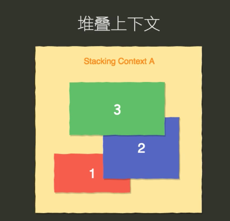
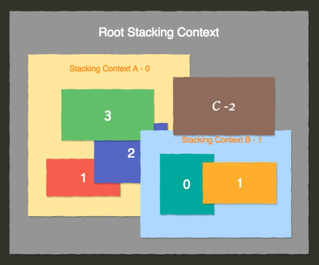
堆叠上下文的生成
Root元素z-index值不为auto的定位元素- 设置了某些
CSS3属性的元素, 如opacity、transform、animation等
绘制顺序
- 在每一个堆叠上下文中, 从下到上
- 形成该上下文的元素的
border和background z-index为负值的子堆叠上下文- 常规流内的块级元素非浮动子元素
- 非定位的浮动元素
z-index为0的子元素或子堆叠上下文z-index为正数的子堆叠上下文
9. 排版细节
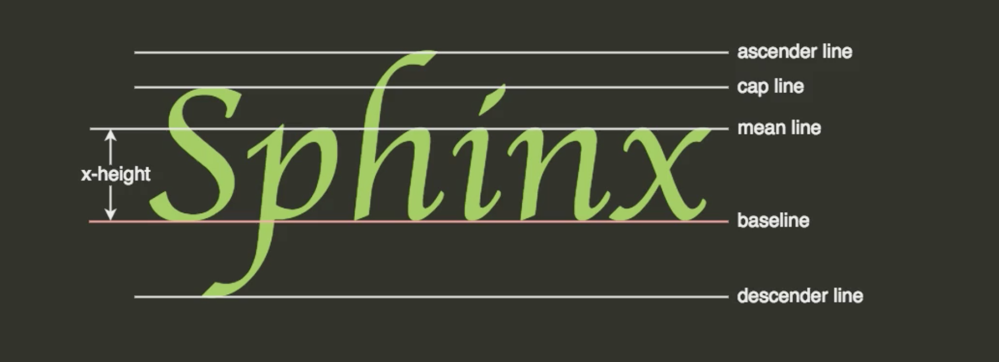
主要介绍的是,行级格式化上下文。
Font Metrics
line-height
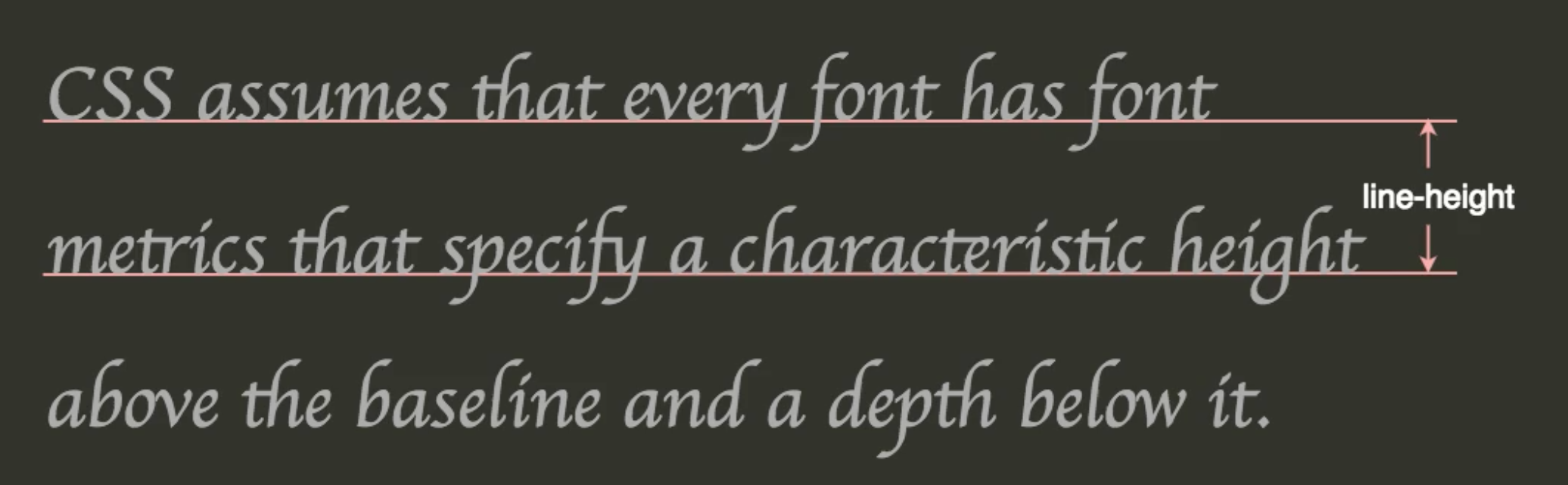
line box内的盒子摆放
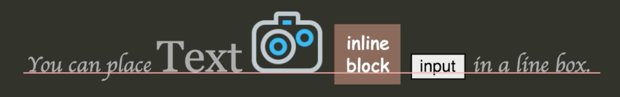
9.1 vertical-align 属性
重点信息
- 定义盒子所处的行盒子(
line box)的垂直对其关系 - 取值
baseline: 默认值, 元素的 baseline 和盒子的 baseline 对齐subsupertoptext-topmiddlebottomtext-bottom<percentage><length>
- 百分比相对于元素自身的行高
- 初始值默认是
baseline
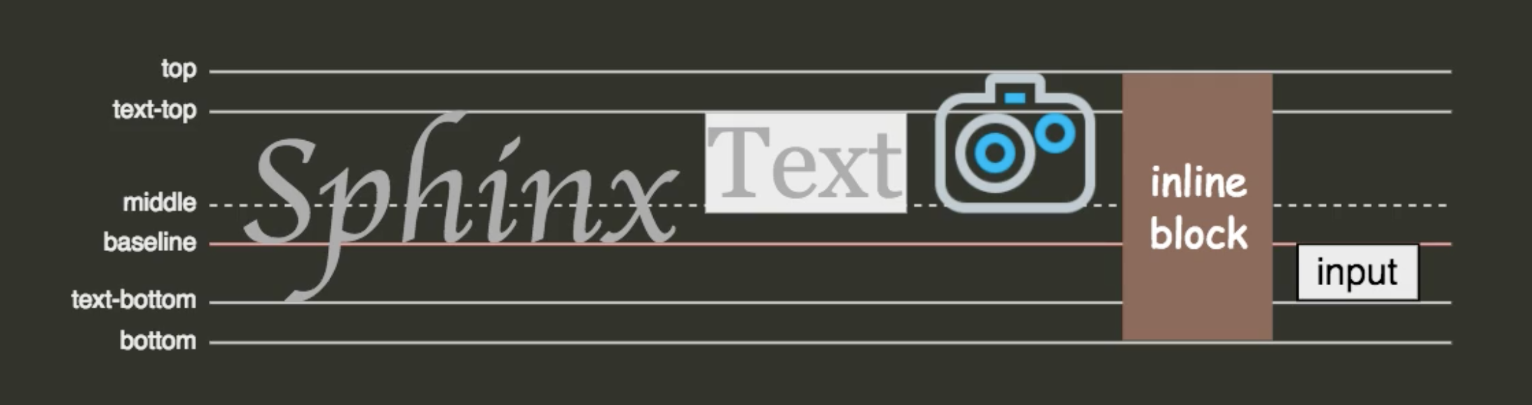
实例演示
- 解决图片留边问题(对齐方式)
<p>
    "y"<img src="http://s3.qhimg.com/static/65796cb8649a8770/d.jpg" alt="car" width="400">
</p>

<!--解决留边问题-->
<style>
    p {
        padding: 0;
        background: red;
    }
    img {
        width: 400px;
        /* 方式一 */
        vertical-align: bottom;
        /* 方式二 */
        display: block;
    }
</style>
9.2 list-style属性
属性说明
声明列表的前置标记属性
display:list-item会生成Principle Block Box和Marker BoxMarker Box的内容和位置可以通过list-style系列属性指定list-style相当于以下三个的简写list-style-type:设置列表项标记的类型list-style-position:设置在何处放置列表项标记list-style-image:使用图像来替换列表项的标记
举例
list-style: circle inside
| 值 | 描述 |
|---|---|
list-style-type |
设置列表项标记的类型 |
list-style-position |
设置在何处放置列表项标记 |
list-style-image |
使用图像来替换列表项的标记 |
list-style-type属性
- 更多属性参考文档
ul.circle {
  list-style-type: circle;
}

ul.square {
  list-style-type: square;
}

ol.upper-roman {
  list-style-type: upper-roman;
}

ol.lower-alpha {
  list-style-type: lower-alpha;
}
list-style-position属性
| 值 | 描述 |
|---|---|
inside |
列表项目标记放置在文本以内,且环绕文本根据标记对齐 |
outside |
默认值。保持标记位于文本的左侧。列表项目标记放置在文本以外,且环绕文本不根据标记对齐 |
inherit |
规定应该从父元素继承 list-style-position 属性的值 |
list-style-image属性
| 值 | 描述 |
|---|---|
URL |
图像的路径, url('/images/blueball.gif') |
none |
默认, 无图形被显示 |
inherit |
规定应该从父元素继承 list-style-image 属性的值 |
9.3 background 属性
在一个声明中设置所有的背景属性
相关属性
| 值 | 描述 | CSS |
|---|---|---|
background-color |
规定要使用的背景颜色 | 1 |
background-position |
规定背景图像的位置 | 1 |
background-size |
规定背景图片的尺寸 | 3 |
background-repeat |
规定如何重复背景图像 | 1 |
background-origin |
规定背景图片的定位区域 | 3 |
background-clip |
规定背景的绘制区域 | 3 |
background-attachment |
规定背景图像是否固定或者随着页面的其余部分滚动 | 1 |
background-image |
规定要使用的背景图像 | 1 |
inherit |
规定应该从父元素继承 background 属性的设置 | 1 |
CSS Sprites
- 就是将多个图片放到一个图片中,只请求一次然后根据位置选择图片,进行排版
<style>
    ul {
        padding: 0;
    }
    li {
        display: block;
        background: url("//p1.ssl.qhimg.com/t0111e26ee101fb8ecb.gif") no-repeat 0 0;
        padding-left: 32px;
        line-height: 1.7;
        margin: 1em 0;
    }
    li.item-2 {
        background-position: 0 -50px;
    }
    li.item-3 {
        background-position: 0 -104px;
    }
</style>

<ul>
    <li class="item-1">Item 1</li>
    <li class="item-2">Item 1</li>
    <li class="item-3">Item 1</li>
</ul>
/* background-size */
<div></div>
<style>
    div {
        border: 1px solid red;
        width: 200px;
        height: 100px;
        background: url(//p5.ssl.qhimg.com/t013753a42172e3170a.jpg) no-repeat auto center;
        background-size: 200px 100px;
    }
</style>
9.4 border-radius/box-shadow
border-radius属性
- 设置所有四个
border-*-radius属性 - 可以使用百分数
box-shadow属性
- 向框添加一个或多个阴影
- 默认是外阴影
| 值 | 描述 |
|---|---|
h-shadow |
必需,水平阴影的位置,允许负值 |
v-shadow |
必需,垂直阴影的位置,允许负值 |
blur |
可选,模糊距离 |
spread |
可选,阴影的尺寸 |
color |
可选,阴影的颜色 |
inset |
可选,将外部阴影 (outset) 改为内部阴影 |
<style>
    #example-1 {
        border-radius: 10px;
    }
    #example-2 {
        border-radius: 10px;
        border: 3px solid green;
    }
    #example-3 {
        border-radius: 5px 20px;
        box-shadow: 102px 50px 0 0 #00f, 50px 40px 0 0 #f00;
    }
    #example-4 {
        border-radius: 10px/30px;
    }
    #example-5 {
        border-radius: 30px/10px;
    }
    #example-6 {
        border-radius: 50%;
    }
    #example-7 {
        width: 200px;
        border-radius: 50%;
    }
    #example-8 {
        width: 200px;
    }
    div {
        background: #BADA55;
        width: 100px;
        height: 100px;
        text-align: center;
        line-height: 100px;
        color: #000;
        font-size: 24px;
        font-family: Helvetica, sans-serif;
        float: left;
        margin: 1em;
    }
</style>

<div id="example-1">1</div>
<div id="example-2">2</div>
<div id="example-3">3</div>
<div id="example-4">4</div>
<div id="example-5">5</div>
<div id="example-6">6</div>
<div id="example-7">7</div>
<div id="example-8">8</div>
10. 布局
布局的方法
floatpositioninline-blocktableflexgrid
10.1 居中
水平居中
- 行级元素
text-align: center- 块级元素
margin: auto
<style>
    article {
        margin-left: auto;
        margin-right: auto;
        padding: 1em;
        background: lightblue;
        line-height: 1.8;
        max-width: 40em;
    }

    h1 {
        text-align: center;
        background: forestgreen;
    }
</style>

<article>
    <h1>people fleeing</h1>
    <p>Hundreds of tweeters have accused Trump of using the
        life-threatening weather event, which has seen tens
        of thousands of people fleeing the Gulf Coast, as a
        “political cover” to deflect attention away from his
        actions.</p>
</article>
垂直居中
- 单行文字
line-height- 行级盒子
vertical-align: middle- 绝对定位
top: 50%; left: 50%
<style>
    p {
        padding: 0 1em;
        background: #eee;
        line-height: 2;
        font-size: 16px;
    }
    em {
        font-size: 12px;
        background: #0c7cd5;
        display: inline-block;
        vertical-align: middle;
        line-height: 1.5;
        padding: 0 0.5em;
        font-style: normal;
        color: #ffffff;
    }
</style>

<p>
    <em>共享</em> 未安装人群
</p>
<!--我们需要知道容器的尺寸, 对其进行一半的偏移量-->
<style>
    .modal {
        position: fixed;
        box-sizing: border-box;
        font-size: 14px;
        width: 20em;
        height: 12em;
        padding: 1em;
        top: 50%;
        left: 50%;
        margin-left: -10em;
        margin-top: -6em;
        border: 1px solid #ccc;
        box-shadow: 1px 1px 5px rgba(0,0,0,0.5);
    }
</style>

<div class="modal" role="dialog">
    <h3>出错了!</h3>
    <p>服务器暂时无法处理您提交的数据, 请稍后再试。</p>
    <div class="action">
        <button>确定</button>
    </div>
</div>
10.2 float
实现两栏布局
<style>
    aside {
        width: 10em;
        float: left;
        background: lightblue;
        min-height: 20em;
    }
    article {
        overflow: hidden;
        background: coral;
        min-height: 20em;
    }
</style>

<main>
    <aside>aside</aside>
    <article>Hundreds of tweeters have accused Trump of using the
        life-threatening weather event, which has seen tens
        of thousands of people fleeing the Gulf Coast, as a
        “political cover” to deflect attention away from his
        actions.</article>
</main>
两栏布局优化
<style>
    main {
        font-size: 14px;
        padding-left: 10em;
    }
    article {
        float: left;
        width: 100%;
        background: coral;
        min-height: 20em;
    }
    aside {
        width: 10em;
        float: left;
        margin-left: -10em;
        position: relative;
        left: -100%;
        background: lightblue;
        min-height: 20em;
    }
</style>

<main>
    <article>Hundreds of tweeters have accused Trump of using the
        life-threatening weather event, which has seen tens
        of thousands of people fleeing the Gulf Coast, as a
        “political cover” to deflect attention away from his
        actions.</article>
    <aside>aside</aside>
</main>
伪等高
<style>
    main {
        font-size: 14px;
        padding-left: 10em;
        overflow: hidden;
    }
    article {
        float: left;
        width: 100%;
        background: coral;
        padding-bottom: 99em;
        margin-bottom: -99em;
    }
    aside {
        width: 10em;
        float: left;
        margin-left: -10em;
        position: relative;
        left: -100%;
        background: lightblue;
        padding-bottom: 99em;
        margin-bottom: -99em;
    }
</style>

<main>
    <article>Hundreds of tweeters have accused Trump of using the
        life-threatening weather event, which has seen tens
        of thousands of people fleeing the Gulf Coast, as a
        “political cover” to deflect attention away from his
        actions.</article>
    <aside>aside</aside>
</main>
10.3 position
实现等高,左右两栏布局
<style>
    main {
        font-size: 14px;
        position: relative;
    }
    article {
        background: coral;
        margin-left: 10em;
    }
    aside {
        width: 10em;
        position: absolute;
        top: 0;
        left: 0;
        bottom: 0;
        background: lightblue;
    }
</style>

<main>
    <article>Hundreds of tweeters have accused Trump of using the
        life-threatening weather event, which has seen tens
        of thousands of people fleeing the Gulf Coast, as a
        “political cover” to deflect attention away from his
        actions.</article>
    <aside>aside</aside>
</main>
10.4 table
不要使用表格标签布局
实现等高,左右两栏布局
<style>
    table {
        width: 100%;
        border-collapse: collapse;
        font-size: 14px;
    }
    th, td {
        border: 1px solid #666;
        padding: 1em;
    }
    tr > :first-child {
        width: 8em;
    }
</style>

<table>
    <thead>
        <tr>
            <th>浏览器</th>
            <th>JS引擎</th>
            <th>CSS引擎</th>
        </tr>
    </thead>
    <tbody>
        <tr>
            <th>Chrome</th>
            <td>V8</td>
            <td>Blink</td>
        </tr>
        <tr>
            <th>Firefox</th>
            <td>Firefox</td>
            <td>Firefox</td>
        </tr>
        <tr>
            <th>Firefox</th>
            <td>Firefox</td>
            <td>Firefox</td>
        </tr>
    </tbody>
</table>
表格一些元素的标识
| 属性 | 对应的标签 |
|---|---|
| display: table | <table> |
| display: table-cell | <td> |
| display: table-row | <tr> |
| display: table-column | <col> |
| display: table-column-group | <colgroup> |
| display: table-footer-group | <tfoot> |
| display: table-header-group | <thead> |
实现等高,左右两栏布局
<style>
    main {
        display: table;
        width: 100%;
        font-size: 14px;
    }
    article, aside {
        display: table-cell;
        padding: 1em;
    }
    article {
        background: coral;
    }
    aside {
        background: cadetblue;
    }
</style>

</head>
<body>
<main>
    <article>Hundreds of tweeters have accused Trump of using the
        life-threatening weather event, which has seen tens
        of thousands of people fleeing the Gulf Coast, as a
        “political cover” to deflect attention away from his
        actions.</article>
    <aside>aside</aside>
</main>
实现导航栏平铺布局
<style>
    nav {
        width: 100%;
        display: table;
        border-collapse: collapse;
        font-size: 14px;
        line-height: 3;
    }
    nav a {
        display: table-cell;
        text-align: center;
        border: 1px solid #fff;
        text-decoration: none;
        color: rgba(255,255,255,0.8);
        background: hsl(181,58%,52%);
    }
    nav a:hover {
        color: #ffffff;
        background: hsl(181,58%,42%);
    }
</style>

<nav>
    <a href="#">Home</a>
    <a href="#">HTML</a>
    <a href="#">JS</a>
    <a href="#">HTTP</a>
</nav>
实现图片居中效果
<style>
    .container {
        display: table-cell;
        text-align: center;
        vertical-align: middle;
        width: 400px;
        height: 400px;
        background: lightblue;
    }
</style>

<div class="container">
    <img src="//p5.ssl.qhimg.com/t013753a42172e3170a.jpg" alt="car" width="200">
</div>
10.5 flex
实现等高,左右两栏布局
- 实现表格等宽布局,根据内容进行调整
<style>
    table {
        width: 100%;
        table-layout: fixed;
        border-collapse: collapse;
        font-size: 14px;
    }
    th, td {
        border: 1px solid #666;
        padding: 1em;
    }
    /* 可以指定表格比例 */
    tr > :first-child {
        width: 8em;
    }
</style>

<table>
    <thead>
        <tr>
            <th>浏览器</th>
            <th>JS引擎</th>
            <th>CSS引擎</th>
        </tr>
    </thead>
    <tbody>
        <tr>
            <th>Chrome</th>
            <td>V8</td>
            <td>Blink</td>
        </tr>
        <tr>
            <th>Firefox</th>
            <td>Firefox</td>
            <td>Firefox</td>
        </tr>
        <tr>
            <th>Firefox</th>
            <td>Firefox</td>
            <td>Firefox</td>
        </tr>
    </tbody>
</table>
10.6 Flexbox
真正为解决布局问题而生的规范
Flexbox可控制子元素
- 水平或垂直排成一行
- 控制子元素对其方式
- 控制子元素的宽/高
- 控制子元素显示顺序
- 控制子元素是否拆行
display: flex
- 将元素变为
Flexbox - 子元素在容器内水平(默认)或垂直摆放
<style>
    ul {
        display: flex;
        padding: 0;
        background: lightblue;
    }
    li {
        list-style: none;
        padding: 1em;
        background: lightblue;
    }
</style>

<ul>
    <li>Item 1</li>
    <li>Item 2</li>
    <li>Item 3</li>
    <li>Item 4</li>
</ul>
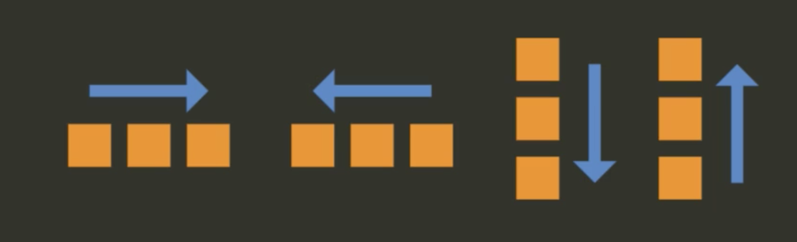
flex-direction
- 子元素排列顺序
- 取值:
row|row-reverse|column|column-reverse
<style>
    ul {
        display: flex;
        flex-direction: row-reverse
        padding: 0;
        background: lightblue;
    }
    li {
        list-style: none;
        padding: 1em;
        background: lightblue;
    }
</style>

<ul>
    <li>Item 1</li>
    <li>Item 2</li>
    <li>Item 3</li>
    <li>Item 4</li>
</ul>
flex-grow
- 定义每一个子元素在盒子内的弹性
- 扩展盒子剩余空间的能力
- 取值: 默认是
0
/* 指定导航栏的元素比例 */
<style>
    ul {
        display: flex;
        padding: 0;
        background: lightblue;
    }
    li {
        list-style: none;
        padding: 1em;
    }
    .item-1 {
        background: lightblue;
        flex-grow: 1;
    }
    .item-2 {
        background: lightgreen;
        flex-grow: 1;
    }
</style>

<ul>
    <li class="item-1">Item 1</li>
    <li class="item-2">Item 2</li>
    <li class="item-3">Item 3</li>
</ul>
flex-shrink
元素收缩的能力
取值: 默认为
1表示可以收缩,0表示不能收缩
<style>
    ul {
        display: flex;
        padding: 0;
        background: lightblue;
    }
    li {
        list-style: none;
        padding: 1em;
    }
    .item-1 {
        background: lightblue;
        flex-grow: 1;
        flex-shrink: 0;
    }
    .item-2 {
        background: lightgreen;
        flex-grow: 1;
    }
</style>

<ul>
    <li class="item-1">Item 1</li>
    <li class="item-2">Item 2</li>
    <li class="item-3">Item 3</li>
</ul>
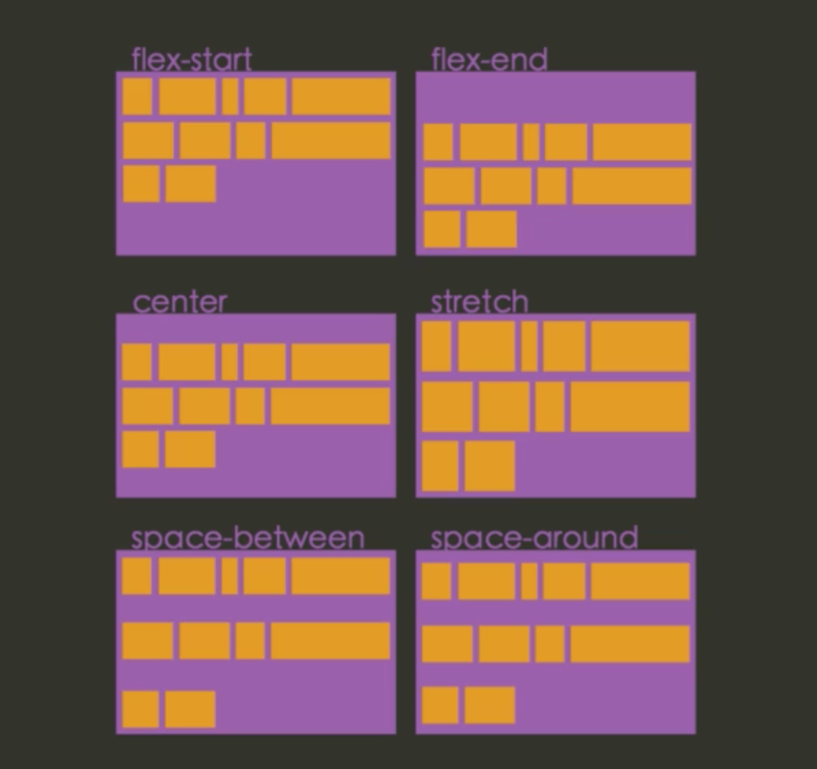
flex-wrap
- 元素在主轴方向排放时,能否换行
- 取值
nowrap表示一行内摆放且不折行wrap折行摆放wrap-reverse逆序摆放
<style>
    ul {
        display: flex;
        flex-wrap: wrap;
        padding: 0;
        background: lightblue;
    }
    li {
        list-style: none;
        padding: 1em;
    }
    .item-1 {
        background: lightblue;
        flew-grow: 1;
    }
    .item-2 {
        background: lightgreen;
        flew-grow: 1;
    }
</style>

<ul>
    <li class="item-1">Item 1</li>
    <li class="item-2">Item 2</li>
    <li class="item-3">Item 3</li>
</ul>
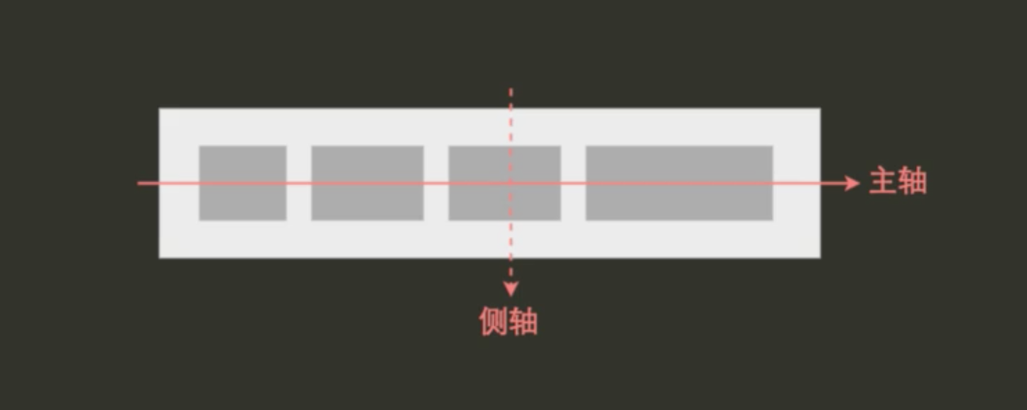
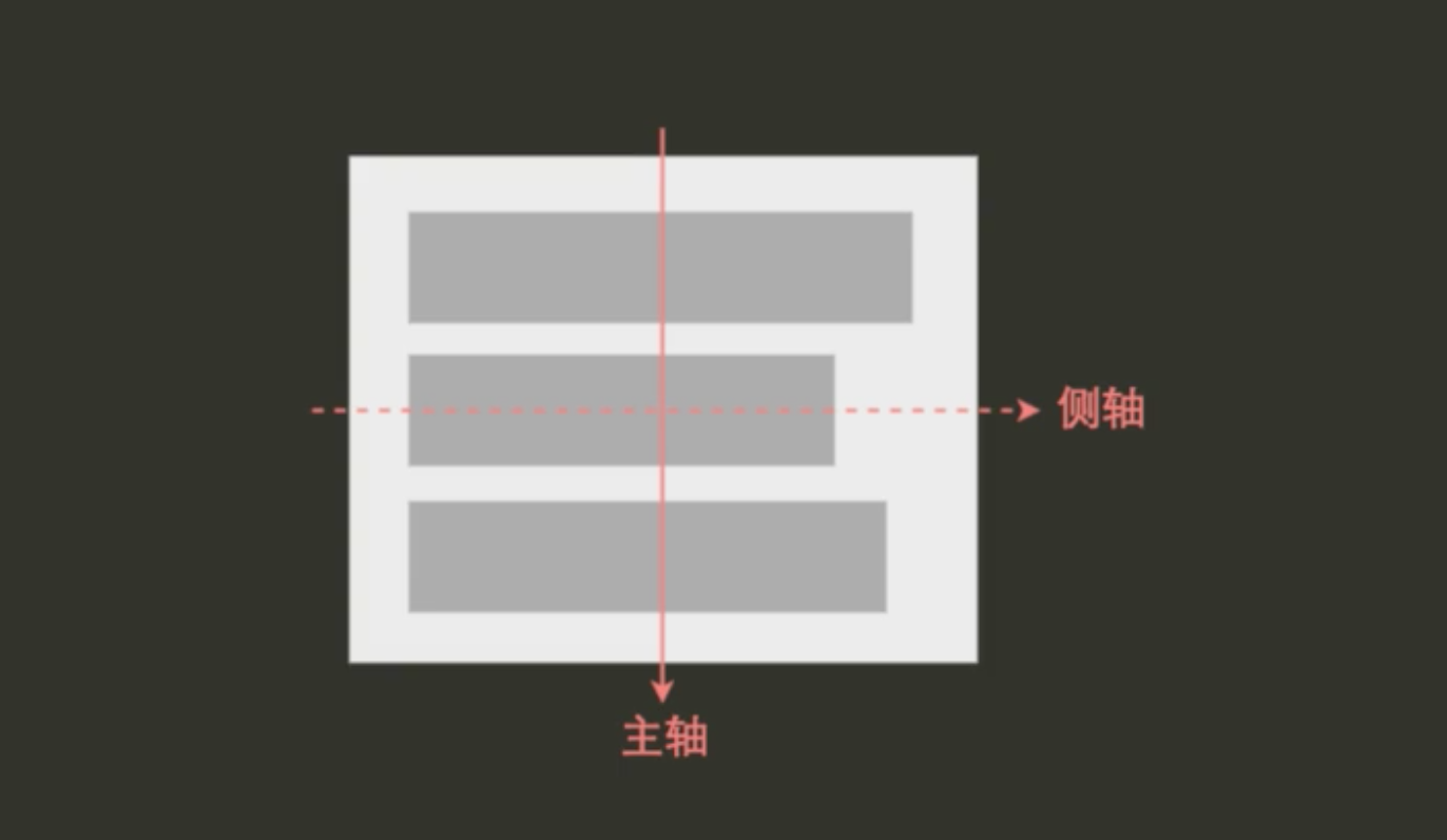
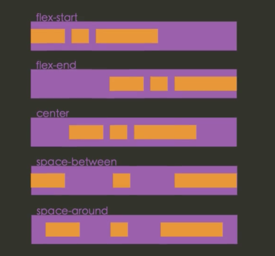
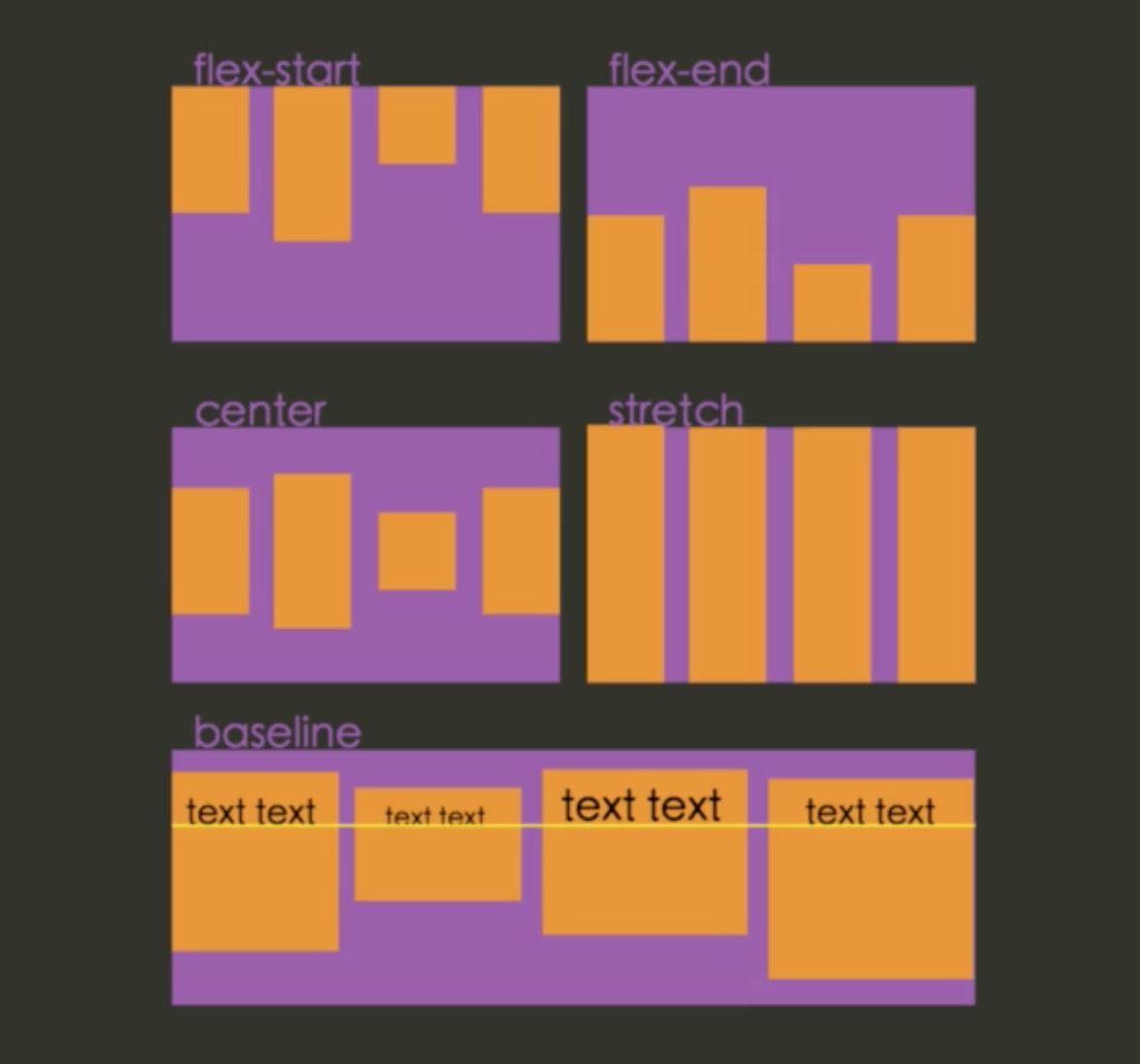
justify-content
- 子元素沿主轴方向的摆放
- 取值
flex-startflex-endcenterspace-betweenspace-around
align-items
- 在侧轴方向的对其方式
- 取值
flex-startflex-endcenterbaselinestretch
- 默认值为
stretch
align-self
- 在子元素中设置的属性
- 设置单独子元素的对其方式
<style>
    ul {
        display: flex;
        padding: 0;
        background: lightblue;
        align-self: flex-start;
    }
    li {
        list-style: none;
        padding: 1em;
    }
    .item-1 {
        background: lightblue;
        flew-grow: 1;
        align-self: flex-end;
    }
    .item-2 {
        background: lightgreen;
        flew-grow: 1;
    }
</style>

<ul>
    <li class="item-1">Item 1</li>
    <li class="item-2">Item 2</li>
    <li class="item-3">Item 3</li>
</ul>
align-content
- 多行内容在容器内侧轴方向的对其
- 取值
flex-startflex-endcenterspace-betweenspace-aroundstretch
order
- 指定摆放时的顺序,从小到大
- 取值: 默认为
0
<style>
    ul {
        display: flex;
        padding: 0;
        background: lightblue;
    }
    li {
        list-style: none;
        padding: 1em;
    }
    .item-1 {
        background: lightblue;
        flew-grow: 1;
    }
    .item-2 {
        background: lightgreen;
        flew-grow: 1;
        order: 1;
    }
    .item-3 {
        background: red;
    }
</style>

<ul>
    <li class="item-1">Item 1</li>
    <li class="item-2">Item 2</li>
    <li class="item-3">Item 3</li>
</ul>
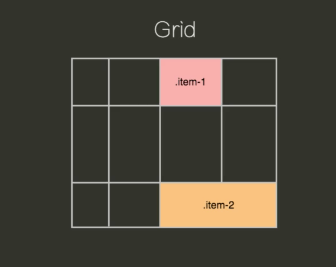
10.7 grid
CSS3 中定义的,所以只有在最新的浏览器中才能使用
11. 动画
11.1 transform
transform变换
- 对元素进行平移、旋转、缩放
transform不会对其它元素布局产生影响- 取值:
none|<transform-list>(一个列表)
<style>
    ul {
        font-size: 14px;
        line-height: 4em;
    }
    li {
        display: block;
        text-align: center;
        margin: 2em;
    }
    li span {
        display: block;
        width: 6em;
        background: coral;
    }
    .item-2:hover span {
        transform: translate(100px, 0);
    }
    .item-3:hover span {
        transform: rotate(45deg);
    }
    .item-4:hover span {
        transform: scale(2, 0.5);
    }
</style>

<ul>
    <li class="item-1"><span>初始状态</span></li>
    <li class="item-2"><span>平移</span></li>
    <li class="item-3"><span>旋转</span></li>
    <li class="item-4"><span>缩放</span></li>
</ul>
transform-list
- 可以在一行中进行平移、旋转、缩放动作
<style>
    div {
        line-height: 6em;
        width: 6em;
        text-align: center;
        margin: 5em;
    }
    .box-1 {
        transform: rotate(-45deg) translate(100px 0);
        background: coral;
    }
    .box-2 {
        transform: translate(100px 0) rotate(-45deg);
        background: lightblue;
    }
</style>

<div class="box-1">box 1</div>
<div class="box-2">box 2</div>
指定某一个坐标轴变换
translateXtranslateYscaleXscaleY
transform-origin
- 指定旋转的中心点
<style>
    ul {
        font-size: 14px;
        line-height: 4em;
    }
    li {
        display: block;
        text-align: center;
        margin: 1em;
    }
    li span {
        display: block;
        width: 6em;
        background: coral;
    }
    li:hover span {
        transform: rotate(45deg);
    }
    .item-2:hover span {
        transform-origin: 0 0;
    }
</style>

<ul>
    <li class="item-1"><span>item 1</span></li>
    <li class="item-2"><span>item 2</span></li>
</ul>
11.2 3D transform
perspective
- 制定进行
3D渲染时,人眼距离Z平面的距离 - 不会影响元素本身的渲染
- 只影响元素的
3D效果
<style>
    div {
        padding: 1em;
        border: 1px solid lightgray;
    }
    p {
        transform: rotateY(45deg);
        margin: 0;
        line-height: 4;
        width: 8em;
        text-align: center;
        background: lightblue;
    }
    .container-3d {
        perspective: 10em;
    }
</style>

<div class="container-2d"><p>2D</p></div>
<div class="container-3d"><p>3D</p></div>
指定某一个坐标轴变换
translate3dtranslateZrotateXrotateY
transition过渡
- 指定从一个样式状态到另一个状态时如何过渡
- 动画的意义:告诉用户发生了什么
transition属性
transition属性可以表示这4中属性transition-property表示那个属性发生变化的时候需要有过渡效果transition-duration表示持续多长时间transition-timing-function表示快慢transition-delay表示延时时间
<style>
    .box {
        transition: all 2s ease-in;
        width: 200px;
        height: 200px;
        margin: 1em auto;
        border: 50px solid red;
    }
    .box:hover {
        width: 0;
        height: 0;
    }
</style>

<div class="box"></div>
<style>
    .box {
        width: 100px;
        height: 100px;
        background: lightblue;
        transition: height 1s ease, width 2s ease-in 1s;
    }
    .box:hover {
        width: 200px;
        height: 200px;
    }
</style>

<div class="box"></div>
animation
animation可以实现更为复杂的样式变化效果- 定义关键帧
- 指定动画行为
<style>
    @keyframes down {
        from {
            margin-top: 0;
            opacity: 1;
        }
        50% {
            margin-top: 0.5em;
            opacity: 0.3;
        }
        to {
            margin-top: 0;
            opacity: 1;
        }
    }
    .say-down {
        position: fixed;
        top: 50%;
        left: 50%;
        margin-left: -0.5em;
        font: normal normal 48px/1 Helvetica;
        color: #f66;
        animation: down 1.5s ease infinite;
    }
</style>

<i class="say-down">(=^_^=)/^^^</i>
12. 特殊选择器
12.1 :target
:target伪类
- 表示元素被
hash匹配时的状态 - 比如
URL是/post/a#heading时,name为heading的元素处于被target的状态
<style>
    p:target {
        color: red;
    }
</style>

<nav>
    <a href="#p1">History</a>
    <a href="#p2">History</a>
    <a href="#p3">History</a>
</nav>
<p id="p1">Leave it to Donald Trump to use a dire situation like Hurricane
    Harvey as an opportunity to boast about how "great" of a job
    he's doing at keeping tabs on it. </p>
<p id="p2">Leave it to Donald Trump to use a dire situation like Hurricane
    Harvey as an opportunity to boast about how "great" of a job
    he's doing at keeping tabs on it. </p>
<p id="p3">Leave it to Donald Trump to use a dire situation like Hurricane
    Harvey as an opportunity to boast about how "great" of a job
    he's doing at keeping tabs on it. </p>
<style>
    p {
        display: none;
    }
    p:target {
        display: block;
    }
</style>

<nav>
    <a href="#p1">History</a>
    <a href="#p2">History</a>
    <a href="#p3">History</a>
</nav>
<p id="p1">Leave it to Donald Trump to use a dire situation like Hurricane
    Harvey as an opportunity to boast about how "p1" of a job
    he's doing at keeping tabs on it. </p>
<p id="p2">Leave it to Donald Trump to use a dire situation like Hurricane
    Harvey as an opportunity to boast about how "p2" of a job
    he's doing at keeping tabs on it. </p>
<p id="p3">Leave it to Donald Trump to use a dire situation like Hurricane
    Harvey as an opportunity to boast about how "p3" of a job
    he's doing at keeping tabs on it. </p>
12.2 :lang
:lang伪类
- 元素匹配上指定语言时的状态
- 浏览器通过
lang属性获得语言信息
<style>
    :lang(fr) q:before {
        content: "<<";
    }
    :lang(fr) q:after {
        content: ">>";
    }
</style>

<section lang="fr">
    <p><q>C'est la vie</q>, il parlait.</p>
</section>
12.3 :nth-child
:nth-child
- 通过
:nth-child(an+b)选中某些子元素 - 例如
:nth-child(3n)选中第3、6、9..个子元素 a可以为负数odd表示单数,even表示双数
<style>
    li:nth-child(3n+1) {
        color: red;
    }
</style>

<ul>
    <li>Item 1</li>
    <li>Item 2</li>
    <li>Item 3</li>
    <li>Item 4</li>
    <li>Item 5</li>
    <li>Item 6</li>
    <li>Item 7</li>
</ul>
<style>
    li:nth-child(odd) {
        color: red;
    }
    li:nth-child(even) {
        color: green;
    }
</style>

<ul>
    <li>Item 1</li>
    <li>Item 2</li>
    <li>Item 3</li>
    <li>Item 4</li>
    <li>Item 5</li>
    <li>Item 6</li>
    <li>Item 7</li>
</ul>
12.4 nth-of-type
nth-of-type
- 表示指定所属类型
<style>
    li:nth-child(3n+1) {
        color: red;
    }
    li:nth-of-type(3n+1) {
        text-decoration: underline;
    }
</style>

<ul>
    <li>Item 1</li>
    <li>Item 2</li>
    <li>Item 3</li>
    <li>Item 4</li>
    <li>Item 5</li>
    <li>Item 6</li>
    <li>Item 7</li>
</ul>
12.5 :first-child
:first-child
- 表示第一个
<style>
    button {
        margin-left: 2em;
    }
    button:first-child {
        margin-left: 0;
    }
</style>

<p>
    text 1
    <button>Button 1</button>
    <button>Button 2</button>
    <button>Button 3</button>
    <button>Button 4</button>
    text 2
</p>
12.6 :last-child
:last-child
- 表示最后一个
<style>
    button {
        margin-left: 2em;
    }
    button:last-child {
        margin-left: 0;
    }
</style>

<p>
    text 1
    <button>Button 1</button>
    <button>Button 2</button>
    <button>Button 3</button>
    <button>Button 4</button>
    text 2
</p>
12.7 :not()
:not()
- 表示否定,派出匹配的元素
- 比如
img:not([alt])选择没有写alt属性的图片
<style>
    button {
        margin-left: 2em;
    }
    button:not(:last-child) {
        margin-left: 0;
    }
</style>

<p>
    text 1
    <button>Button 1</button>
    <button>Button 2</button>
    <button>Button 3</button>
    <button>Button 4</button>
    text 2
</p>
12.8 :empty
:empty
- 选中标签中没有内容的子元素
<style>
    li:empty {
        display: none;
    }
</style>

<ul>
    <li>Item 1</li>
    <li></li>
    <li>Item 3</li>
</ul>
12.9 其他选择器
** 其他选择器**
:nth-last-of-type表示选中最后的所属类型:first-of-type表示选中第一个的样式:last-of-type表示选中最后一个的样式only-child表示选中唯一的元素only-of-type表示指定唯一的元素的样式
12.10 ::first-line
::first-line
::表示伪元素- 表示选中第一行
<style>
    p::first-letter {
        color: red;
    }
</style>

<p>While the awards program for 2018 was canceled, the EPA's former
    co-sponsors, non-government organizations C2ES and the Climate
    Registry, intend to continue the tradition. They're now looking
    for a new co-sponsor willing to fund and host the program in
    the future.</p>
12.11 ::first-letter
::first-letter
::表示伪元素- 表示选中第一字符
<style>
    p::first-letter {
        color: red;
        font-size: 2em;
        float: left;
    }
</style>

<p>While the awards program for 2018 was canceled, the EPA's former
    co-sponsors, non-government organizations C2ES and the Climate
    Registry, intend to continue the tradition. They're now looking
    for a new co-sponsor willing to fund and host the program in
    the future.</p>
12.12 兄弟选择器
- 相邻兄弟选择器
E+F - 通用兄弟选择器
E~F - 都表示
E之后进行选择
<style>
    h2 + p {
        color: red;
    }
    h2 ~ p {
        text-decoration: underline;
    }
</style>

<section>
    <p>Test</p>
    <h2>rise test</h2>
    <p>for 2018 was canceled</p>
    <p>While the awards program</p>
</section>
实现一个开关按钮
<style>
    .toggle {
        width: 80px;
        height: 26px;
        background: #333;
        margin: 20px auto;
        position: relative;
        border-radius: 50px;
        box-shadow: inset 0px 1px 1px rgba(0,0,0,0.5), 0px 1px 0px rgba(255,255,255,0.2);
    }
    .toggle:before {
        content: 'ON';
        color: #f66;
        position: absolute;
        left: 10px;
        z-index: 0;
        font: 12px/26px Arial, sans-serif;
        font-weight: bold;
    }
    .toggle label {
        display: block;
        width: 34px;
        height: 20px;
        cursor: pointer;
        position: absolute;
        top: 3px;
        left: 3px;
        z-index: 1;
        background: #fcfff4;
        background: linear-gradient(top, #fcfff4 0%, #dfe5d7 40%, #b3bead 100%);
        border-radius: 50px;
        transition: all 0.4s ease;
        box-shadow: 0px 2px 5px 0px rgba(0,0,0,0.3);
    }
    .toggle input[type=checkbox] {
        visibility: hidden;
    }
    .toggle input:checked + label {
        left: 43px;
    }
</style>

<div class="toggle">
    <input type="checkbox" checked id="t">
    <label for="t"></label>
</div>
13. 响应式页面设计
同一个页面可以适应不同屏幕大小设备的设计方案
viewport
<meta name="viewport" content="width=device-width, initial-scale=1.0">
13.1 响应式的图片
- 大图随容器自动缩放,保持高宽比
max-width: 100%
<style>
    body {
        margin: 0;
    }
    img {
        max-width: 100%;
    }
</style>

<img src="xxx.jpg" alt="flower">
背景图片
background-size: cover- 图片信息不太重要,可以被裁切
background-size: contain- 图片信息比较重要,不希望被裁切
<style>
    div {
        position: fixed;
        top: 0;
        left: 0;
        bottom: 0;
        right: 0;
        background: url("//p0.jscssimg.com/ac1feb9e05cf5752.jpg") no-repeat center center;
        background-size: cover;
    }
</style>

<div></div>
保持宽高比
<style>
    div {
        height: 0;
        padding-top: 50%;
        background: #f99;
    }
</style>

<div></div>
13.2 两栏:自适应布局
float与BFC- 绝对定位
- 模拟
table flex布局
实现自适应的搜索框
<style>
    form {
        margin-right: 4em;
        position: relative;
    }
    form input {
        width: 100%;
        font-size: inherit;
        line-height: 1.4;
    }
    form button {
        position: absolute;
        left: 100%;
        top: 0;
        width: 4em;
        font-size: inherit;
    }
</style>

<form>
    <input type="search">
    <button>搜索</button>
</form>
实现自适应导航栏布局
<style>
    body {
        margin: 0;
    }
    nav {
        display: table;
        width: 100%;
        background: #00BCD4;
    }
    nav a {
        display: table-cell;
        text-decoration: none;
        color: #ffffff;
        padding: 0 1em;
        font: normal 14px/2 Helvetica, sans-serif;
    }
    nav a:not(:first-child) {
        border-left: 1px solid rgba(255,255,255,0.7);
    }
</style>

<nav>
    <a href="#">HOME</a>
    <a href="#">JS</a>
    <a href="#">CSS</a>
    <a href="#">HTML</a>
    <a href="#">HTTP</a>
</nav>
13.3 网格布局,自动换行
inline-block + justifyflex
<style>
    ul {
        margin: 0;
        padding: 0;
        text-align: justify;
    }
    li {
        display: inline-block;
        width: 30%;
        height: 0;
        padding-top: 20%;
        background: lightblue;
        text-align: center;
        margin-bottom: 1em;
    }
</style>

<ul>
    <li>1</li>
    <li>2</li>
    <li>3</li>
    <li>4</li>
    <li>5</li>
    <li>6</li>
    <li>7</li>
</ul>
<style>
    ul {
        margin: 0;
        padding: 0;
        text-align: justify;
    }
    li {
        display: block;
        width: 4em;
        height: 3em;
        background: lightblue;
        text-align: center;
        margin: 1em;
    }
</style>

<ul>
    <li>1</li>
    <li>2</li>
    <li>3</li>
    <li>4</li>
    <li>5</li>
    <li>6</li>
    <li>7</li>
</ul>
13.4 media query
- 针对不同的屏幕,应用不同的样式
/* 声明方式 */
<link rel="stylesheet" href="m.css" media="screen and (max-width: 480px)">

/* css文件方式 */
@media screen and (min-width: 480px) {
  .selector {
    ...;
  }
}
<style>
    body {
        margin: 0;
    }
    nav {
        display: flex;
        width: 100%;
        background: #00BCD4;
    }
    nav a {
        flex: 1;
        text-decoration: none;
        color: #ffffff;
        padding: 0 1em;
        font: normal 14px/2 Helvetica, sans-serif;
    }
    nav a:not(:first-child) {
        border-left: 1px solid rgba(255,255,255,0.7);
    }
    @media screen and (min-width: 480px) {
        nav {
            flex-direction: column;
        }
        nav a:not(:first-child) {
            border-left: none;
            border-top: 1px solid rgba(255,255,255,0.7);
        }
    }
</style>

<nav>
    <a href="#">HOME</a>
    <a href="#">JS</a>
    <a href="#">CSS</a>
    <a href="#">HTML</a>
    <a href="#">HTTP</a>
</nav>
可以查询的media
widthheightdevice-widthdevice-heightdevice-pixel-ratioorientation
14. 浏览器兼容性
CSS 中的兼容性问题
- 浏览器不支持该特性
- 某些特定条件下触发浏览器
bug
14.1 浏览器的相关问题
了解浏览器支持情况
caniuse.comMDB CSS ReferenceCodrops CSS ReferenceQuirksMode.org CSS
你需要兼容哪些浏览器?
- 根据用户群体决定
- 面向普通用户:
IE8+、Chrome、Firefox - 企业级用户:
IE9+、Chrome、Firefox - 了解浏览器市场份额
- 日志分析
- 百度统计
NetMarketShare
浏览器不支持时怎么办?
- 如果低版本浏览器没有这个特性可以接受吗?
border-radius不支持时,没有圆角box-shadow不支持时,没有阴影- 可以使用效果稍微差一些地替代方案吗?
min-height: 100vh用min-height: 800px替代- 可以使用一些替代方案吗?
opacity: 0.5在IE下用filter: alpha(opacity=50)- 可以使用
JS让浏览器支持吗? - 使用
html5shim.js让IE6~8支持新标签 - 使用
DD_belatedPNG.js让IE6支持半透明png图片 - 更换实现方式
14.2 兼容的解决方式
不同浏览器适用不同的样式
解决方式
@supports- 层叠
- 条件注释
- 浏览器怪癖
@supports
.container {
  display: flex;
}

@supports (display: grid) {
  .container {
    display: grid;

    grid-template: repeat(4, 1fr) / 50px 100px;
  }
}
浏览器hack原理 —— 层叠
- 同一个属性,后面书写的值覆盖前面书写的值
- 对浏览器无效的属性值会被忽略
p {
  line-height: 2;

  line-height: 3;
}

p {
  display: talbe;

  display: flex;
}
浏览器hack原理 —— 条件注释
/* 只在IE下生效 */
<!--[if IE]>
这段文字只在IE浏览器显示
<![endif]-->

只在IE6下生效
<!--[if IE 6]>
这段文字只在IE6浏览器显示
<![endif]-->

只在IE6以上版本生效
<!--[if gte IE 6]>
这段文字只在IE6以上(包括)版本IE浏览器显示
<![endif]-->

只在IE8上不生效
<!--[if ! IE 8]>
这段文字在非IE8浏览器显示
<![endif]-->

非IE浏览器生效
<!--[if !IE]>
这段文字只在非IE浏览器显示
<![endif]-->
浏览器的怪癖
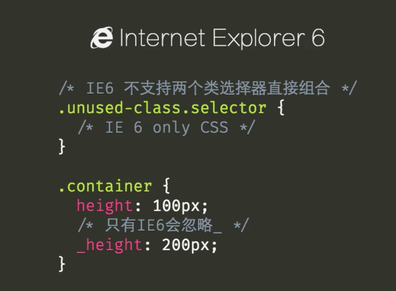
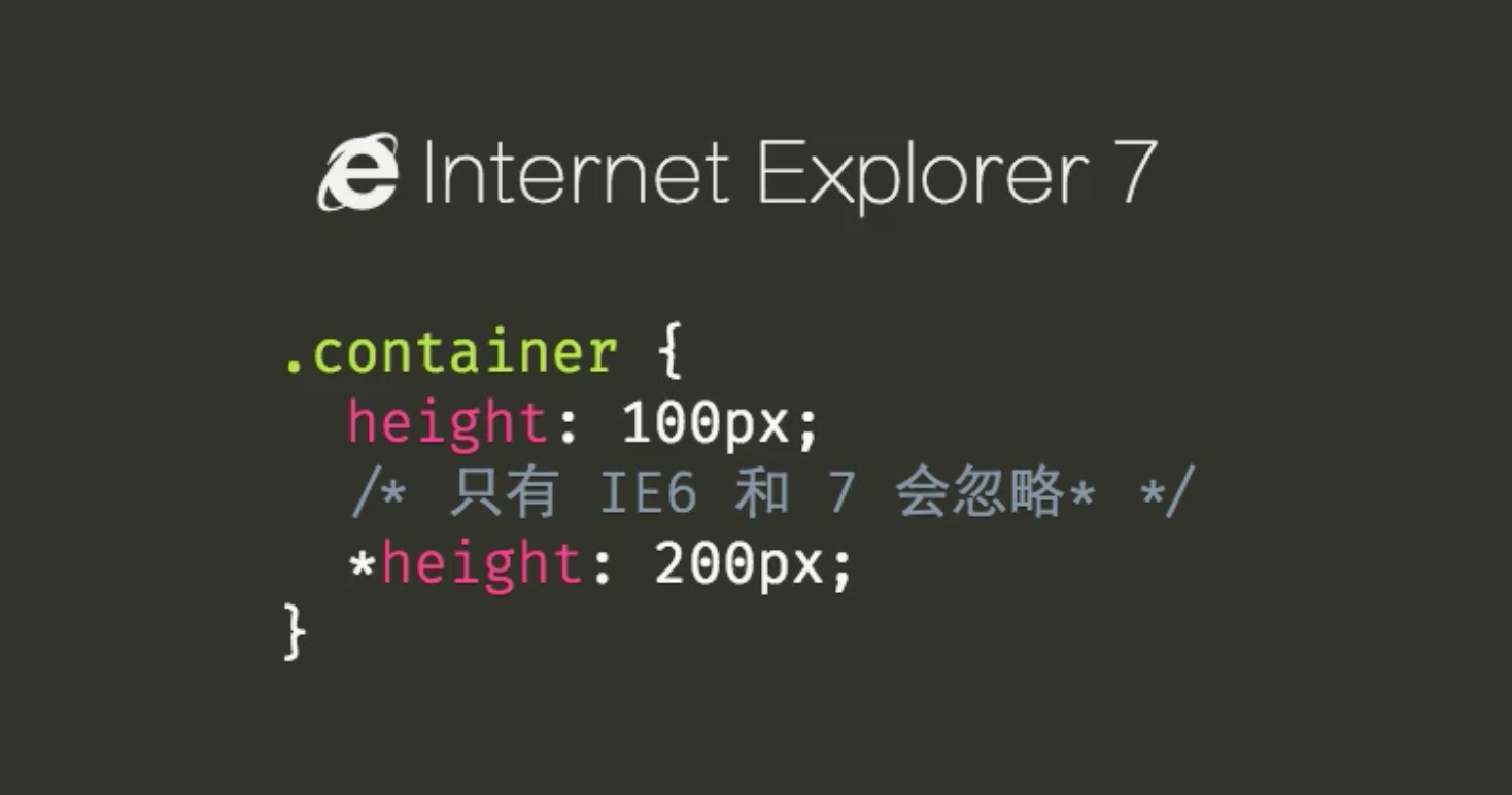
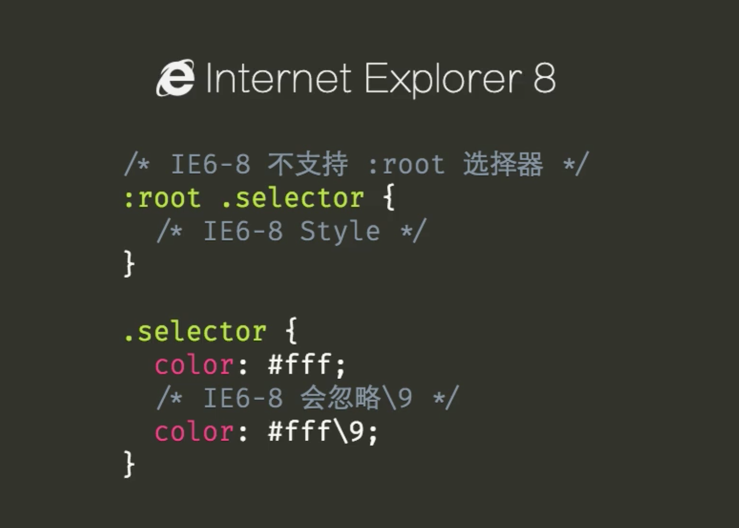
.tip {
  background: blue;

  background: red\9;

  *background: black;

  _background: orange;
}
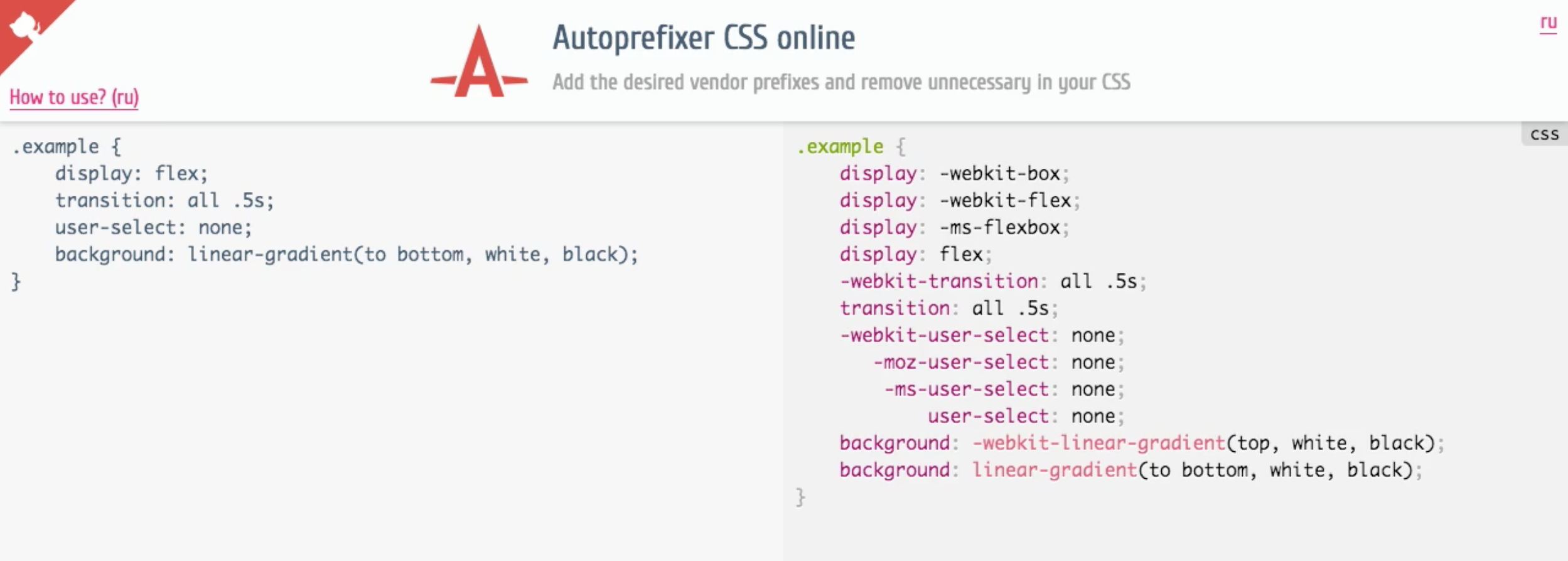
14.3 浏览器的前缀
浏览器的前缀
- 浏览器厂商为了实现新特性,在属性名之前添加前缀
Chrome/Safari/Opera: -webkit-Microsoft: -ms-Mozilla: -moz-
解决前缀的方法
Autoprefixer CSS online
IE6~8中引入标签
- 是要使用
html5shiv.js
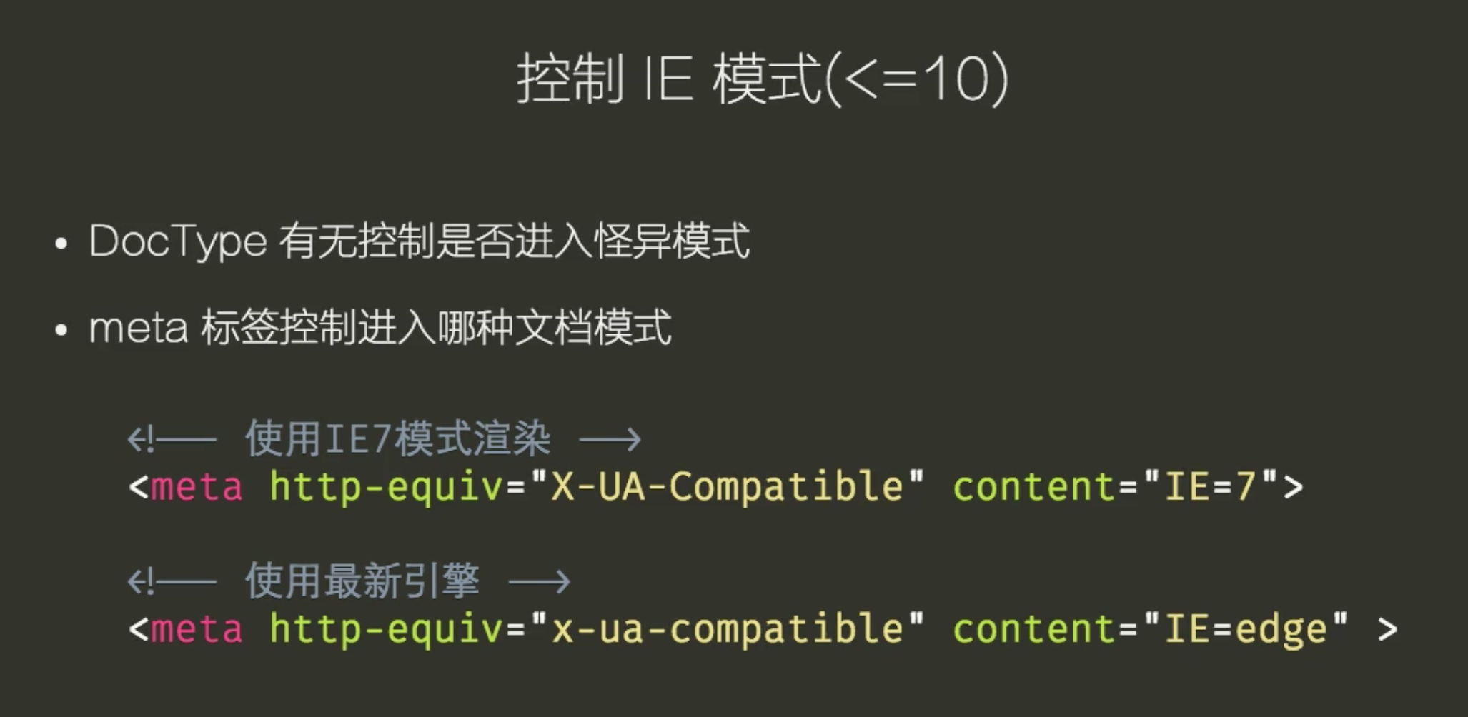
14.4 浏览器bug
IE模式
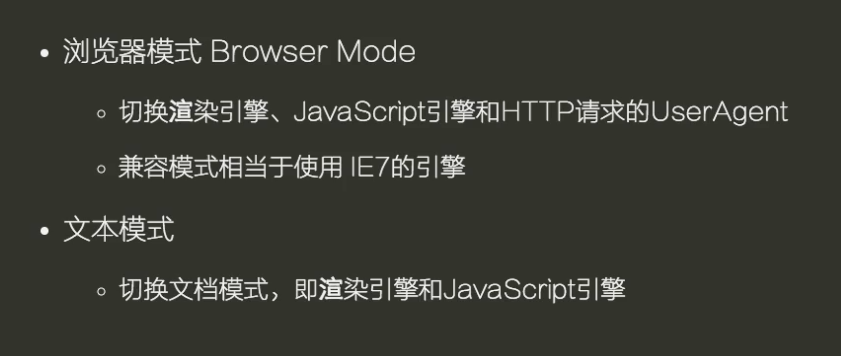
测试兼容性
- 虚拟机
BrowserStack
14.5 polyfill
- 使用代码帮助浏览器实现它尚未支持的特性
- 使用未来的标准写法
CSS polyfillsselectivizrCSS3 PIEbox-sizing-polyfillflexibilitycssSandpaper
15. CSS 工程化
工程化的目的是为了提供一致、合理的开发基础,应对变化以及提升效率。
工程化文件结构
css
|
| -- base
|    |-- normalize.css
|    |-- mixins.css
|    |-- layout.css
|    `-- variables.css
|
| -- modules
|    | -- button.css
|    | -- checkout.css
|    | -- dialog.css
|    | -- input.css
|    | -- form.css
|    | -- modal.css
|    | -- pagination.css
|    | -- radio.css
|    | -- tab.css
|    | -- table.css
|    | -- select.css
|    | -- top.css
|    `-- textarsa.css
|
` -- pages
    | -- index.css
    | -- page-a.css
    | -- page-b.css
    ` -- page-c.css
15.1 CSS Reset & normalize.css
CSS Reset
- 设置
HTML标签的默认样式 - 使其在各个浏览器表现基本一致
- 让默认样式归零
normalize.css
- 设置
HTML标签的默认样式 - 使其在各个浏览器表现基本一致
- 保留标签的默认样式
参考链接
15.2 CSS 模块
CSS 模块
- 可复用的 CSS 代码段
- 与模块在
HTML中的位置无关 - 一般与使用的
HTML标签无关
CSS 模块原则
- 面向对象
- 单一职责原则
- 开闭原则
Don't Repeat Yourself
面向对象的原则
- 结构和皮肤分离
.btn、.btn--primary、.btn--info、.btn--danger- 结构和内容分离
/* 不推荐这样写 */

.header .btn {
  color: red;
}
单一职责原则
- 尽可能细的拆分成可独立复用的组件
- 通过组合方式使用多个组件
- 比如将布局和其他样式拆分
不要重复(Don't Repeat Yourself)
15.3 命名
命名
- 基于功能
- 它是用来干什么的?
.button/.form/.list/tab-item/.nav- 基于内容
- 元素里面放的是什么内容?
.news/.user-info/.help/.contact-me- 基于视觉
- 看起来是什么样?
.rountd-image/.noewrap
命名原则
- 优先使用基于功能的命名方式
- 样式和内容无关
- 中小型网站可以使用基于内容去命名
- 大型网站可以使用语句视觉去命名
- 不要使用太具体的样式
CSS 命名规范
- 规范
.block__element--modifierBEMBlock:ElementModifier
15.4 编写简洁易维护的 CSS 代码
CSS 预处理